Helping Patients Choose Fasenra With Confidence
A mobile-first, ADA compliant redesign of the Fasenra patient site with clearer journeys and easier access to support.
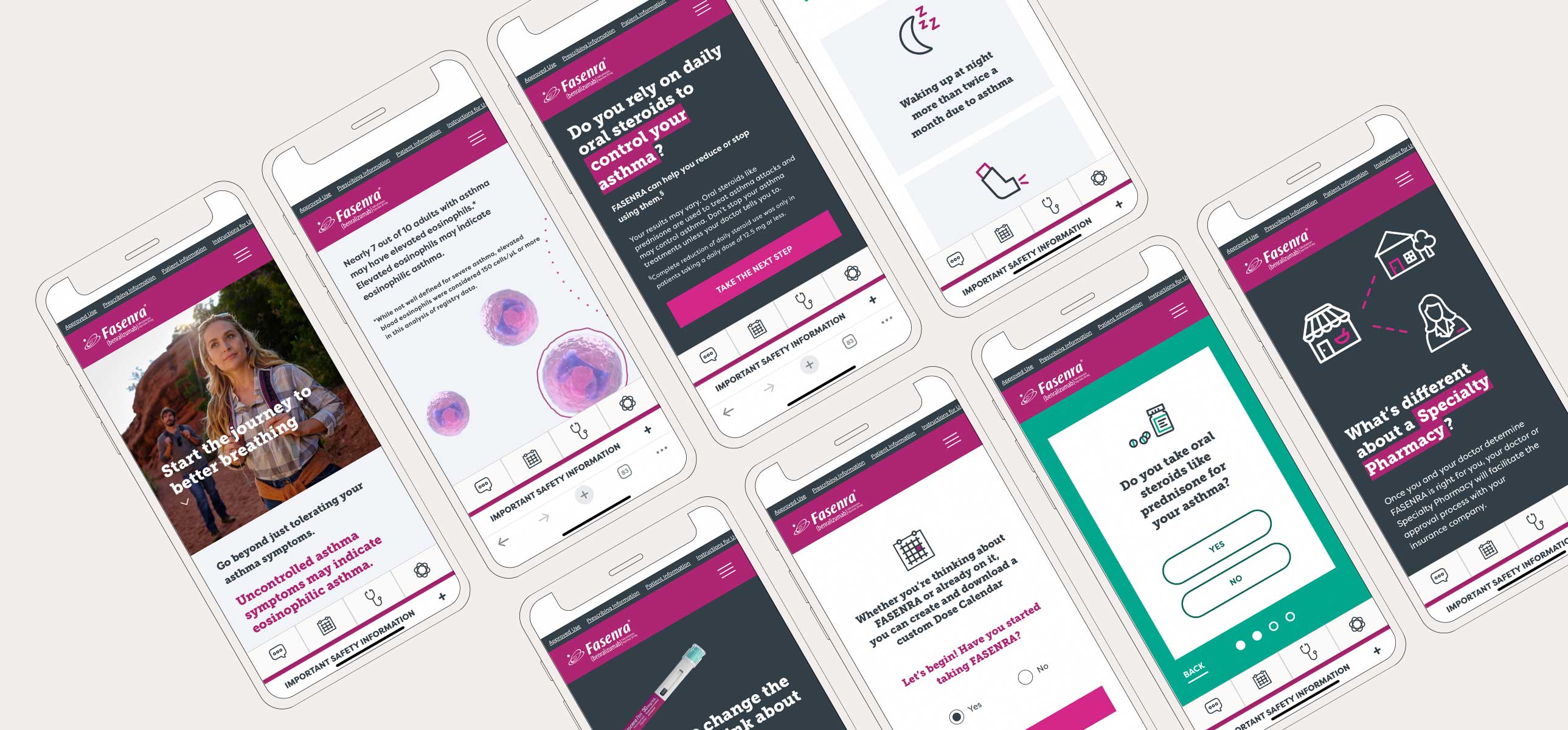
A redesign of the Fasenra patient website to position it as the first-choice biologic for eosinophilic asthma and future indications. I shaped the patient journeys and UX priorities, working with a visual designer and copywriter through MLR approval and launch.
The challenge
A simpler, more modern experience
The goal was a branded destination that simplifies and modernizes the Fasenra experience, so patients could:
- Understand their triggers and the importance of seeing their healthcare provider.
- Recognize themselves in the content and ask for Fasenra with confidence.
- Stay on treatment, with fewer patients dropping off.
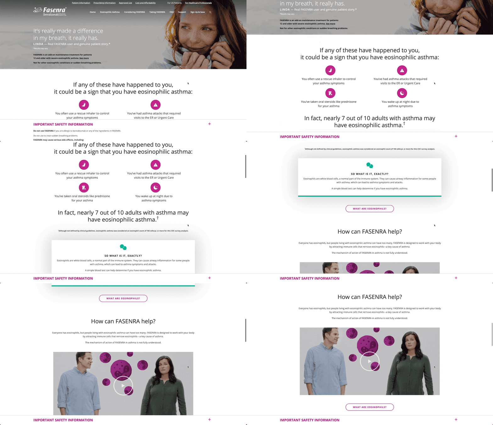
Where it started
The approach
UX priorities
- Mobile first: typography, imagery, and UX optimized for mobile.
- Key actions: streamlined navigation tailored to each user segment.
- Information architecture: content and design aligned with what users expect to find.
- Support tools: Fasenra 360 and other tools made easy to find.
- Contextual CTAs: relevant calls to action placed where they help, with less clutter.
- A clear patient journey: a defined conversion funnel with a clear path forward.
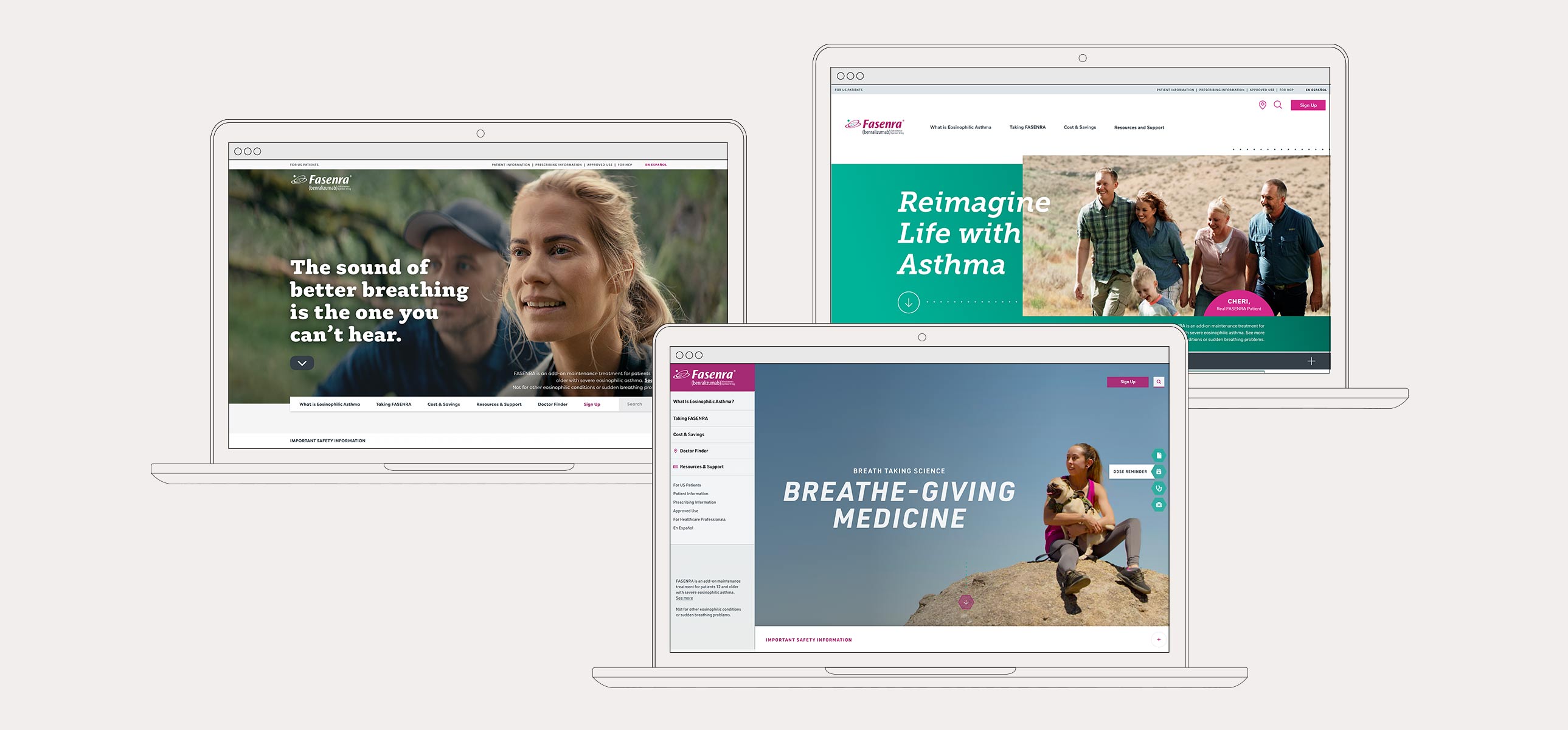
Design exploration
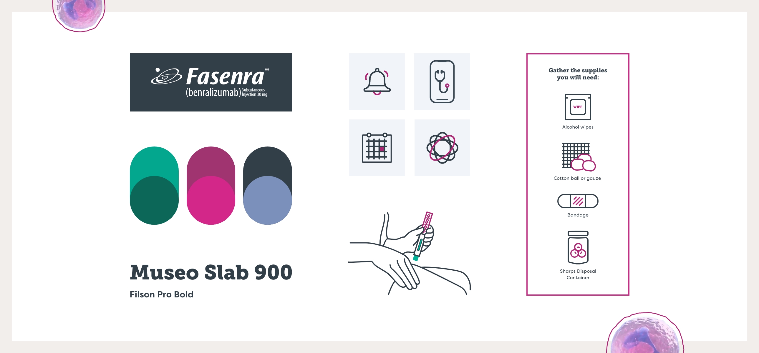
ADA compliant branding
The color palette was refined to meet ADA requirements, landing on a blend of teal and claret.
The design
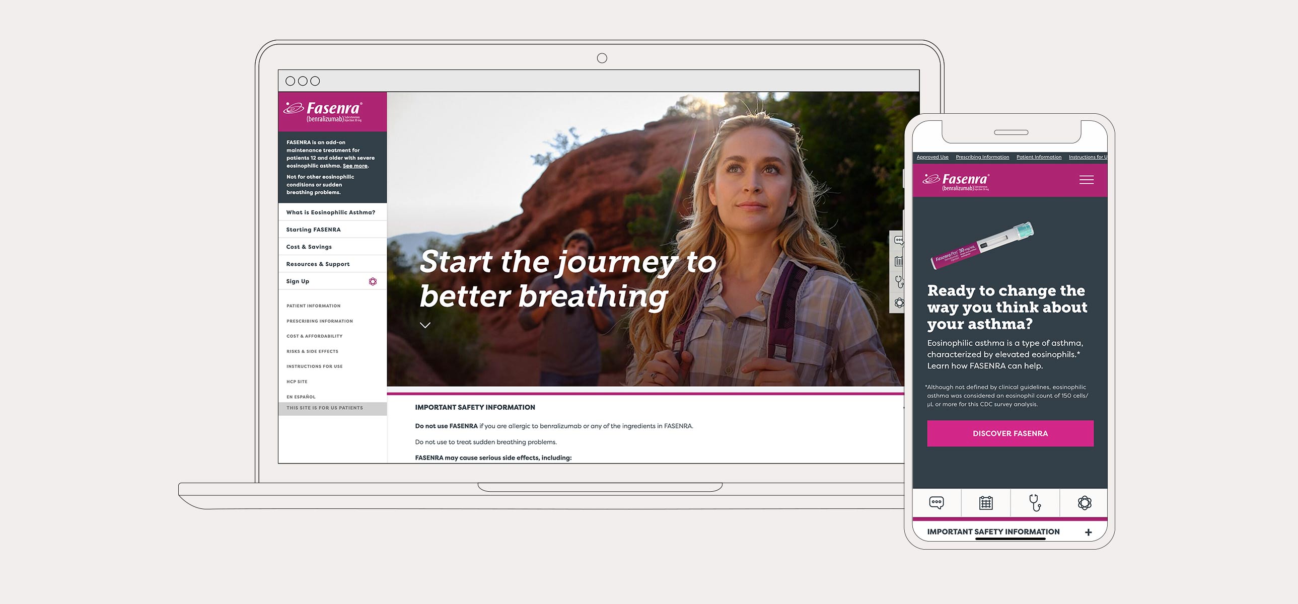
Relaunching Fasenra DTC
Distinct audience journeys closed gaps in the experience, and interactive polls gathered patient insights. An FAQ block on every page links to dedicated FAQ articles to expand organic search visibility.
A redesigned design system brought a clear visual hierarchy and the flexibility to fine-tune brand typography and color while meeting ADA standards.
The result
The redesigned Fasenra patient site was approved through medical, legal, and regulatory (MLR) review and launched in 2022.