UX That Means Business: How Uttermost Grew Sales by 20%
A multi-brand redesign that simplified ordering and product discovery for retailers and reps, lifting revenue 20%.

A redesign of the Uttermost website focused on the people who buy from it: retailers, designers, and sales representatives. I led discovery and UX with my team of designers and developers, focused on how retailers and reps actually order. Revenue rose 20%, transactions 13%, and average order value 6%.
The challenge
A better way to shop for distributors
Uttermost wanted a significantly better shopping experience for its distributors: easier navigation, better product discovery, and a simpler ordering process.
The design
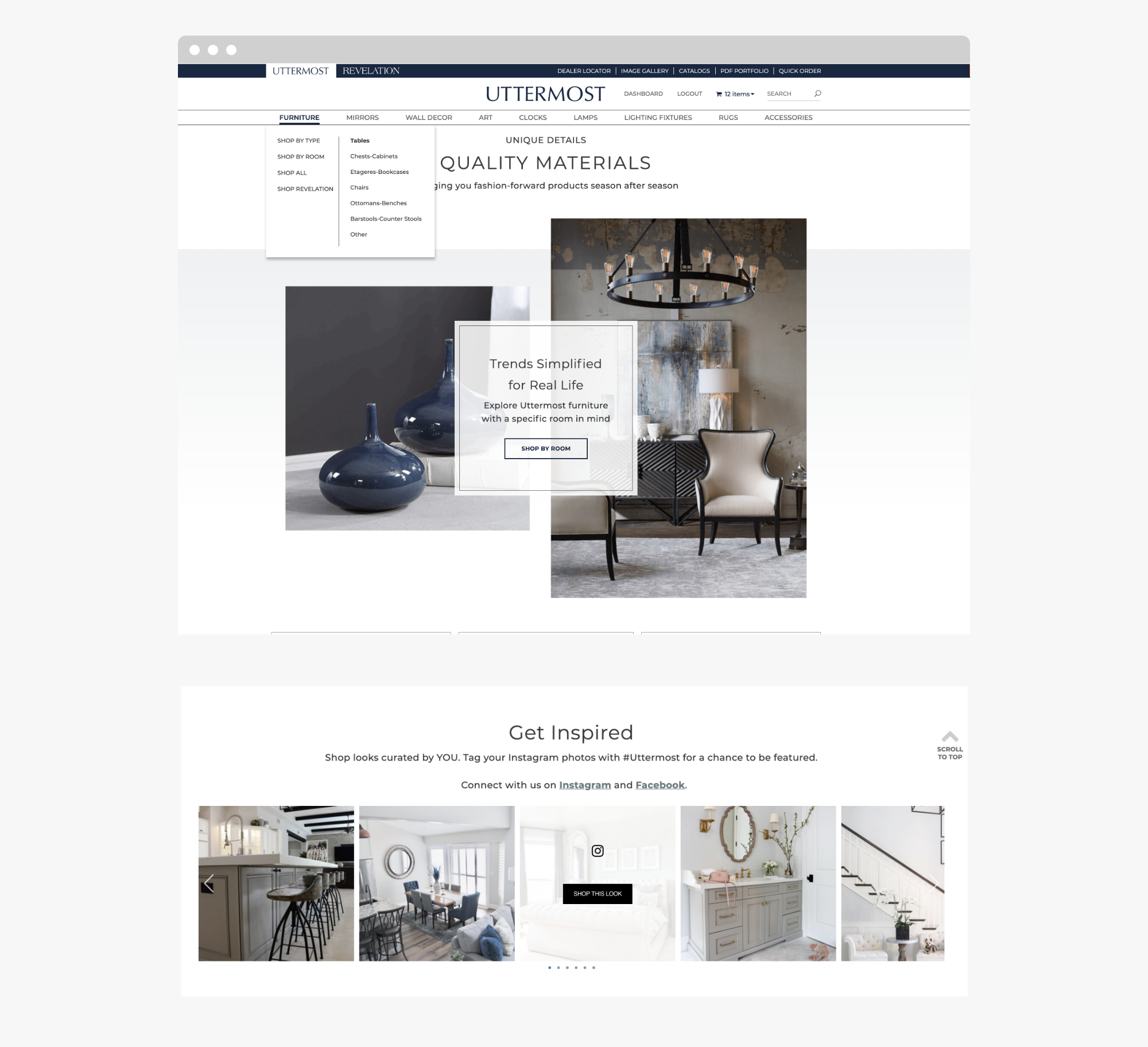
Two brands, one site
The multi-brand site gives retailers, designers, and sales representatives separate, on-brand shopping experiences for the Uttermost and Revelation product lines. Rich product presentation, customer-focused UX, and responsive mobile design were the priorities.

Product discovery
Collections take center stage, and visitors can shop by room, type, style, shape, finish, and more. An Instagram-driven gallery invites users to "shop this look" with customer-curated products.
Filters and Quick View
Category pages use filters for style, color, size, and other variations. Silo images keep the grid clean, and hover reveals lifestyle and room photography. Quick View opens product images and details in a popover so retailers can browse without leaving the category page.

Retailer dashboard
Portals for retailers and sales representatives make it easy to manage the business, including order history and invoices.

The result
Revenue rose 20%, transactions 13%, and average order value 6%.